
| 일 | 월 | 화 | 수 | 목 | 금 | 토 |
|---|---|---|---|---|---|---|
| 1 | ||||||
| 2 | 3 | 4 | 5 | 6 | 7 | 8 |
| 9 | 10 | 11 | 12 | 13 | 14 | 15 |
| 16 | 17 | 18 | 19 | 20 | 21 | 22 |
| 23 | 24 | 25 | 26 | 27 | 28 | 29 |
| 30 | 31 |
- FirebaseV9
- 강화학습 기초
- ReactNative
- redux
- Instagrame clone
- 데이터분석
- 카트폴
- 조코딩
- TeachagleMachine
- pandas
- 클론코딩
- 전국국밥
- kaggle
- 머신러닝
- selenium
- expo
- 사이드프로젝트
- JavaScript
- 앱개발
- coding
- 리액트네이티브
- clone coding
- 딥러닝
- python
- 강화학습
- React
- 크롤링
- App
- Ros
- 정치인
- Today
- Total
qcoding
6) [사이드 프로젝트]App개발-전국국밥찾기 -> Drawer Navigator 본문
티스토리를 통해 글로 정리하는 것이 은근히 시간이 많이 걸리는 일이라, 개발을 다 마치고 차례대로 글을 작성하려고 한다.
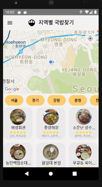
현재 아래 화면은 최종 완성된 DrawerNavigator 사용화면이다. 코드를 하나하나 찾아 보면서 어떻게 구성되어 있는지 확인하고자 한다.
이전 글을 보면 TabNavigator를 사용하였는데, DrawerNavigator을 한번도 사용한 적이 없어서 이번기회에 사용법을 알기 위해서 적용해 보았다.
1) 전체적인 Navigator 구성
-> 내가 구성한 Navigator는 크게 Root Nav(Native Stack) 아래에 1) DrawerNav 2) Stack 으로 구성되어 있다.
다시 Drawer에는 3개의 tab이 있으며 Stack아래에는 Detail 페이지가 존재한다.
1) App.js
  // App.js 실행 시 Root Navigator로 이동한다.

  return (
    <>
    <DBContext.Provider value={{customData:customData,realmFavorite:realmFavorite}}>
        <StatusBar style="auto" />
        <NavigationContainer>
          <Root></Root>
        </NavigationContainer>
    </DBContext.Provider>
    </>
  );
2) Root..js
import React from 'react'
import { View, Text } from 'react-native'
import {createNativeStackNavigator} from '@react-navigation/native-stack';
import Tabs from './Tabs';
import Stack from './Stack';
import DrawerNav from './DrawerNav';
import { LogBox } from 'react-native';

LogBox.ignoreLogs([
  "[react-native-gesture-handler] Seems like you\'re using an old API with gesture components, check out new Gestures system!",
]);

const Nav=createNativeStackNavigator();

const Root = () => {
    return (
        <Nav.Navigator screenOptions={{presentation:"modal", headerShown:false}} >
            <Nav.Screen name="DrawerNav" component={DrawerNav}></Nav.Screen>
            <Nav.Screen name="Stack" component={Stack}></Nav.Screen>
        </Nav.Navigator>
    )
}

export default Root
3) DrawerNav.js
import * as React from 'react';
import {View, Text } from 'react-native';
import { createDrawerNavigator,DrawerContentScrollView,DrawerItemList,DrawerItem} from '@react-navigation/drawer';
import Food from './../pages/Food';
import Favorite from './../pages/Favorite';
import Game from './../pages/Game';
import styled from 'styled-components/native';
import { MaterialIcons } from '@expo/vector-icons';


const DrawerTitle=styled.View`
  align-items:center;
  justify-content:center;
  padding:30px 10px;
`;

const DrawerText=styled.Text`
  color:black;
  font-size:30px;
  font-weight:bold;
`;

const HeaderTitleContainer=styled.View`
  flex:1;
  justify-content:center;
  align-items:center;
`;

const Drawer = createDrawerNavigator();

function CustomDrawerContent(props)
  { return (
    <DrawerContentScrollView {...props} style={{backgroundColor:"white"}}>
      <DrawerTitle>
        <DrawerText>MENU</DrawerText>
      </DrawerTitle>
      <DrawerItemList {...props}/>
      {/* <DrawerItem label="help" onPress={() => alert("추가 하는 Item")} />  */}
    </DrawerContentScrollView> ) }


function DrawerNav() {


  return (
    <>
      <Drawer.Navigator initialRouteName="Food"
        screenOptions={{
          drawerActiveTintColor:"blue",
          // headerShown:false,
          headerTitleAlign:"center",
          drawerType:"front",
          drawerPosition:"left",
          headerTitleStyle: {
            color: "black",
          },
          headerStyle: {
            backgroundColor: "white",
          },
          drawerStyle:{
            backgroundColor: "white",
        },
        }}
        drawerContent={(props) => <CustomDrawerContent {...props} />}
        >
      <Drawer.Screen name="Food" component={Food}
        options={{
          headerTitle :()=>{
            return(
              <HeaderTitleContainer>
                <View style={{flexDirection:"row"}}>
                  <MaterialIcons name="rice-bowl" size={30} color="black"/>
                  <Text style={{fontSize:20,fontWeight:"bold",marginLeft:10}}>지역별 국밥찾기</Text>
                </View>
              </HeaderTitleContainer>
            )
          },
          drawerLabel:()=>{
            return(
              <View style={{width:200}}>
                <Text style={{fontSize:18,fontWeight:"bold",marginBottom:8}}>지역별 국밥찾기</Text>
                <Text style={{fontSize:10}}>지역별 국밥집을 한눈에 찾아보세요!</Text>
              </View>
            )
          },
          drawerIcon:({focused,color,size})=>{
          return(
            <View style={{alignSelf:"flex-start",marginTop:5}}>
             <MaterialIcons name={focused?"rice-bowl":"rice-bowl"} size={35} color={focused?"#0984e3":"black"}  />
            </View>
          )}
         }}
      />
      <Drawer.Screen name="Favorite" component={Favorite}
        options={{
          headerTitle :()=>{
            return(
              <HeaderTitleContainer>
                <View style={{flexDirection:"row"}}>
                  <MaterialIcons name="favorite" size={30} color="black"/>
                  <Text style={{fontSize:20,fontWeight:"bold",marginLeft:10}}>나만의 국밥집 LIST</Text>
                </View>
              </HeaderTitleContainer>
            )
          },
          drawerLabel:()=>{
            return(
              <View style={{paddingRight:52,width:200}}>
                <Text style={{fontSize:18,fontWeight:"bold",marginBottom:8}}>나만의 국밥집 LIST</Text>
                <Text style={{fontSize:10}}>나만의 국밥집 리스트를 저장하여 친구와 공유해 보세요</Text>
              </View>
            )
          },
          drawerIcon:({focused,color,size})=>{
          return(
            <View style={{alignSelf:"flex-start",marginTop:7}}>
              <MaterialIcons name={focused?"favorite":"favorite"} size={35} color={focused?"#c0392b":"black"}  />
            </View>
          )}
          }}

      />
      <Drawer.Screen name="Game" component={Game}
        options={{
          headerTitle :()=>{
            return(
              <HeaderTitleContainer>
                <View style={{flexDirection:"row"}}>
                  <MaterialIcons name="videogame-asset" size={30} color="black"/>
                  <Text style={{fontSize:20,fontWeight:"bold",marginLeft:10}}>내기 할래?</Text>
                </View>
              </HeaderTitleContainer>
            )
          },
          drawerLabel:()=>{
            return(
              <View style={{paddingRight:5}}>
                <Text style={{fontSize:18,fontWeight:"bold",marginBottom:8}}>내기 할래?</Text>
                <Text style={{fontSize:10}}>친구들 혹은 동료들과 식사 후 가볍게 커피내기 어떠세요?</Text>
              </View>
            )
          },
          drawerIcon:({focused,color,size})=>{
          return(
            <View style={{alignSelf:"flex-start",marginTop:7}}>
              <MaterialIcons name={focused?"videogame-asset":"videogame-asset"} size={35} color={focused?"green":"black"}  />
            </View>
          )}
          }}
      />
    </Drawer.Navigator>
    </>

  );
}

export default DrawerNav;
4) Stack (detail 페이지)
import React from 'react'
import { View, Text } from 'react-native'
import {createNativeStackNavigator} from '@react-navigation/native-stack';
import Detail from '../pages/Detail';

const NativeStack=createNativeStackNavigator();

const Stack = () => {
    return (
    <NativeStack.Navigator>
        <NativeStack.Screen name="Detail" component={Detail}></NativeStack.Screen>
    </NativeStack.Navigator>
    )
}

export default Stack
위와 같이 구성되어 있다. 이제부터 육안으로 확인하기 쉽게 사진과 코드를 가지고 DrawerNavigator가 어떻게 구성되어있는 지 확인하려고 한다.
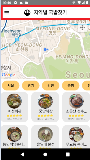
◆ Title 화면
// Navigator의 대부분 설정은 ScreenOptions에서 설정할 수 있다.
// ScreenOptions는 navigator 의 아래에 있는 스크린 전체에 적용되는 옵션이라고 생각하면 된다.

<Drawer.Navigator initialRouteName="Food"
        screenOptions={{
          drawerActiveTintColor:"blue",
          // headerShown:false,
          headerTitleAlign:"center",
          drawerType:"front",
          drawerPosition:"left",
          headerTitleStyle: {
            color: "black",
          },
          headerStyle: {
            backgroundColor: "white",
          },
          drawerStyle:{
            backgroundColor: "white",
        },
        }}
        drawerContent={(props) => <CustomDrawerContent {...props} />}
        >
</<Drawer.Navigator>
◆ Navigator 화면

<Drawer.Screen name="Food" component={Food}
        options={{
          headerTitle :()=>{
            return(
              <HeaderTitleContainer>
                <View style={{flexDirection:"row"}}>
                  <MaterialIcons name="rice-bowl" size={30} color="black"/>
                  <Text style={{fontSize:20,fontWeight:"bold",marginLeft:10}}>지역별 국밥찾기</Text>
                </View>
              </HeaderTitleContainer>
            )
          },
          drawerLabel:()=>{
            return(
              <View style={{width:200}}>
                <Text style={{fontSize:18,fontWeight:"bold",marginBottom:8}}>지역별 국밥찾기</Text>
                <Text style={{fontSize:10}}>지역별 국밥집을 한눈에 찾아보세요!</Text>
              </View>
            )
          },
          drawerIcon:({focused,color,size})=>{
          return(
            <View style={{alignSelf:"flex-start",marginTop:5}}>
             <MaterialIcons name={focused?"rice-bowl":"rice-bowl"} size={35} color={focused?"#0984e3":"black"}  />
            </View>
          )}
         }}
      />
위에서 보면 options안에 headerTitle : ()=>{} 에 해당되는 것은 Title화면에 있는 제목이며, drawerLabel:()=>{} 안에 들어있는 것은 Navigator 화면에 표시된 글이다. 또한 drawerIcon : ()=>{} 의 경우는 Icon에 대한 정보가 들어가게 되며 focus 시에 Icon의 색이 바뀔 수 있게 하였다.
여기서 한가지 알아두면 좋은 게 Title 화면에 들어 있는
◆ CustomDrawerCotent
// <Drawer.Navigator> 안에 들어 있는 <CustomDrawerContent>에 관한것이다.
// 공식문서에 보면 사용법이 나와 있는데 대략 적인 것을 살펴보려고 한다.

drawerContent={(props) => <CustomDrawerContent {...props} />}


// 이 코드는 drawerTab을 클릭하면 나오는 화면을 사용자가 설정할 수 있게 하는 것이다.

function CustomDrawerContent(props)
  { return (
    <DrawerContentScrollView {...props} style={{backgroundColor:"white"}}>
    // 이 아래 부분에 내가 커스텀으로 사용할 컴포넌트를 넣을수 있다.
    // 내 경우에는 MENU 글자를 넣었다.
      <DrawerTitle>
        <DrawerText>MENU</DrawerText>
      </DrawerTitle>
    // 이 부분에는 위에서 작성한 <Drawer.Screen>에 들어가는 내용이 자동으로 들어간다.
    // {...props}는 들어가는 설정들이 들어가 있으므로 삭제해서는 안된다.
      <DrawerItemList {...props}/>

    // 라벨의 형태로 누르면 작동하는 logout이나 정보등을 아래와 같이 작성할 수 있다.

      {/* <DrawerItem label="help" onPress={() => alert("추가 하는 Item")} />  */}

</DrawerContentScrollView> ) }'[사이드 프로젝트]App개발 - 전국 국밥 찾기' 카테고리의 다른 글
| 8)[사이드프로젝트]App개발-전국국밥_realm를 사용한 list 저장 페이지 (2) | 2022.02.06 |
|---|---|
| 7)[사이드프로젝트]App개발-전국국밥_지역별 국밥찾기 페이지 (0) | 2022.02.06 |
| 5) ReactNative를 통한 App개발 진행 상황 (0) | 2022.01.15 |
| 4) Excel 파일로 JSON 형태 변경 및 Firebase 데이터 저장 (0) | 2022.01.14 |
| 3) 카카오 Api를 활용한 geocode로 위도/경도 찾기 (0) | 2022.01.10 |


