
반응형
Notice
Recent Posts
Recent Comments
Link
| 일 | 월 | 화 | 수 | 목 | 금 | 토 |
|---|---|---|---|---|---|---|
| 1 | ||||||
| 2 | 3 | 4 | 5 | 6 | 7 | 8 |
| 9 | 10 | 11 | 12 | 13 | 14 | 15 |
| 16 | 17 | 18 | 19 | 20 | 21 | 22 |
| 23 | 24 | 25 | 26 | 27 | 28 | 29 |
| 30 |
Tags
- expo
- 머신러닝
- clone coding
- redux
- 사이드프로젝트
- GYM
- selenium
- 강화학습 기초
- 데이터분석
- React
- kaggle
- Ros
- python
- 리액트네이티브
- FirebaseV9
- 카트폴
- pandas
- 앱개발
- ReactNative
- 딥러닝
- 조코딩
- 전국국밥
- 클론코딩
- TeachagleMachine
- JavaScript
- Reinforcement Learning
- coding
- 강화학습
- Instagrame clone
- App
Archives
- Today
- Total
qcoding
[데이터 분석실습]타이타닉 데이터 본문
반응형
### 타이타닉 데이터를 통해서 여러 데이터 전처리 과정을 익힌다.
1) 데이터 불러오기
import pandas as pd
import numpy as np
import seaborn as sns
import matplotlib as mpl
import matplotlib.pyplot as plt

owner = 'datasciencedojo'
repo='datasets'
branch='master'
file_path='titanic.csv'


df=pd.read_csv(f'https://raw.githubusercontent.com/{owner}/{repo}/{branch}/{file_path}')
df
2) 데이터 전처리
1) 데이터 타입변경

## Survived , Pclass는 범주형 변수이므로 str type으로 변경함
df['Survived'] = df['Survived'].astype(str)
df['Pclass'] = df['Pclass'].astype(str)
df.info()
df.describe(include='all').T
2) 데이터 분석
## Pclass 변수 분석
grouped = df.groupby('Pclass',as_index=False)
grouped.size()
-> 3등급에 있는 사람들이 491명으로 제일 많음
## subplot 생성
mpl.rc('font',size=13)
figure , axes = plt.subplots(nrows=1 , ncols=2)
plt.tight_layout()
figure.set_size_inches(11,5)

## Fare요금
sns.histplot(data=df, x='Fare', bins=10 , ax=axes[0])


##Boxplt Survived에 따른 Fare 값의 분포
data_0 = df.loc[df['Survived']==0,'Fare']
data_1=df.loc[df['Survived']==1,'Fare']

sns.boxplot(x='Survived' ,y='Fare',data=df, hue='Sex', ax=axes[1])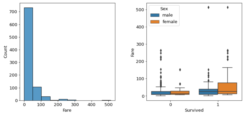
--> Pclass의 이상치 제거 필요함
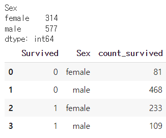
## Sex 변수 분석
# 빈도수 계산
grouped = df.groupby('Sex')
print(grouped.size())


##  성별 생존자 수
df.groupby(['Survived','Sex'],as_index=False).agg(
    count_survived=('Sex','count')
)
반응형
'Python 데이터분석' 카테고리의 다른 글
| [데이터분석실습][데이터전처리]스타벅스 고객 데이터 분석하기 (0) | 2022.08.06 |
|---|---|
| [데이터분석 실습][데이터전처리]구글플레이스토어 데이터 분석 (1) | 2022.07.29 |
| [데이터분석실습][회귀-LGBM/XGB] 향후 판매량 예측 _ 회귀 (0) | 2022.07.12 |
| [데이터분석실습][이진분류_LR]_Categorical Feature Encoding Challenge (0) | 2022.07.03 |
| [데이터분석실습][회귀_RF/RIDGE/LASSO]자전거 수요예측 (0) | 2022.07.01 |
'Python 데이터분석' Related Articles
more


Comments